


To design a mobile app that lets users order their food or book the best place to eat near by them quickly and easily.
I decided to go with a lean UX approach for this project. By testing ideas and getting real-time feedback, I was able to craft something that really resonates with users. This framework allowed me to build something people will love by learning directly from them along the way.

Search — Our filters and predictive search options are here to help you navigate and find exactly what you’re looking for.
Notification — Get notified about your order history, new offers, and more, so you never miss a thing.
Customization — Customize your orders to suit your needs, because we believe everyone deserves a personalized experience.
Payment Modes — We offer various payment methods, including net banking, credit card, debit card, and cash on delivery.
Live Update — Track your food delivery right to your doorstep with our live update feature.
Restaurant Profile — Discover quality food and reserve a table with the help of restaurant details, reviews, and ratings.
Repeat — Save time and quickly reorder your favorite dishes thanks to our handy dining history feature.
I developed a user persona to represent tumzey’s target audience and gain a better understanding of their behavior and motivations. This persona was formed based on the competitive analysis I conducted and my personal experience using other food delivery applications. While the persona was not fully researched and relied on assumptions, it served as a valuable guide for my design decisions and priorities throughout the project.

When considering the impact of color on a restaurant’s success, research suggests that orange is a particularly effective choice. This is due in part to the fact that orange is often associated with comfort and impulsiveness. Additionally, orange is a color that can stimulate all of the senses, which can be highly beneficial in creating a positive dining experience. By incorporating orange into the design of a restaurant, whether it be a cafe, bistro, or diner, the color can help to increase sales and encourage conversation among customers. Ultimately, this can lead to customers spending more time in the establishment and ultimately spending more money, as the color orange is often associated with good value.

Poppins is a geometric font with a clean style that offers 18 different weights, ranging from thin to black. This range of font styles makes it suitable for both headlines and body copy, improving both readability and style.
It is a great choice if your style is:

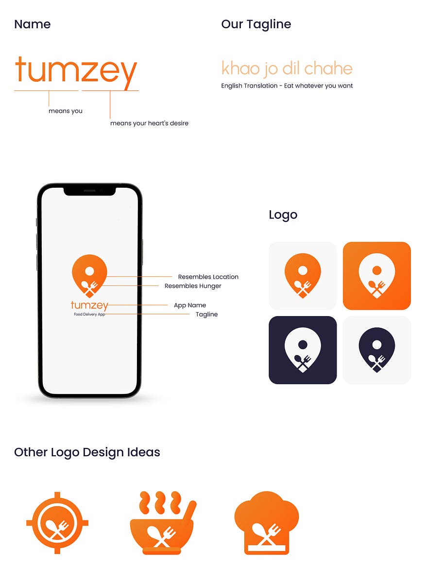
Here’s how I came up with the name, tagline, and logo design for Tumzey.
Here is a portion of the whole user flow showing the decisions that the user and system can make in the process of browsing through dishes, ordering food or booking reservations.

Check it out! This user research method is a go-to for information architects and user experience designers. It’s a great way to get inside the heads of target users and see how they’re thinking about an information space.

I examined different food delivery services and made notes on the best layouts. Before committing to high-fidelity wireframe designs for the key displays, I drew rough draughts of potential solutions on Sketch. This allowed me to experiment with layouts rather than concentrating on the finer points of design.

After fixing all the necessary usability issues, I then went on to create mockups and a high-fidelity prototype of the design. Below are all the screen with their key information to share for your better understanding.

For this case study, more than 22 high-fidelity screens were created.

To test the user experience of the app, I conducted a survey among different people around me. I asked them to perform specific tasks in the Figma prototype while I recorded their actions and took notes. Some of the tasks or questions given to them were as follows:
This is what users had to say during the usability tests:
“Did you make this app? This is great.”
“I like this better.”
“‘Saving our favorite dish to reorder quickly is the best feature”
“So easy and friendly to use, great job”
I used Figma to create a functional prototype of all the screens. Check it out here.📱📲
I felt both excited and nervous about this project. I was excited because I was doing something I love, but nervous because I knew it was going to be a lot of work and my first proper case study. Despite my nerves, I saw this as the perfect opportunity to improve my design skills by working through the messy design process. Working on projects like this reminds me of the adage: “Practice makes perfect”.
“Design used to be the seasoning you’d sprinkle on for taste; now it’s the flour you need at the start of the recipe.”
— John Maeda, Designer and Technologist
I had a great time working on this project and I hope you enjoyed reading about it too. Please show your appreciation by giving a 👏🏽 below and leaving comments and suggestions. If you think there are areas where I excelled or could improve, I would love to discuss it in the comments. Thank you for reading!
You can connect with me on LinkedIn, Behance or simply send me an e-mail (akshatkharex@gmail.com).


